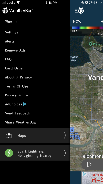
WeatherBug is a multi-platform tool for weather forecast, they are in responsive websites and mobile app. However, the current version of app is containing a variety of UI weak points.
Project’s Target
Through this project I aim at:
Better Readability: Improve readability by changing colour, typography, layout. Make it more friendly to users.
Modern looking: Changing look and feel by using simplicity design style. Improve icons and illustration elements.
Leverage UX: Although this project is mainly about UI, I still adapt some points that will help UX. I think good UX is critical to a product.
Colour Palette
I used the brand colour of the app (Green and Dark Green), and picked new colours based on functionality. Each colour play a role in my design:
Green: Nature, forest, leaves… Used in icons and some illustrations.
Blue: Main colour, create a fresh look as well as remind of sky, rain, rivers… I also use dark blue as “night” mode.
Hot colours: Orange, linear orange-yellow, hot pink: to create Sun, Light, Flashing…
Grey Scale: Used as background.

Typography
I choose Niveau Grotesk typeface for this project. This is a good X-height font with proper characteristics such as informative, friendly.

Icons
Icons for this project is created simply but very balanced based on lines and geometric shapes. Some special icons have green / orange colour to highlight the natural feeling.

Illustrations
Illustrations were made with 3D affects. The affect was created by linear colours. All illustration should have the same height as 48px, their width are 56px.
I also created a bigger illustration for homepage. This one can be replaced by some relevant counterparts for night, rain, snowy…

Navigations
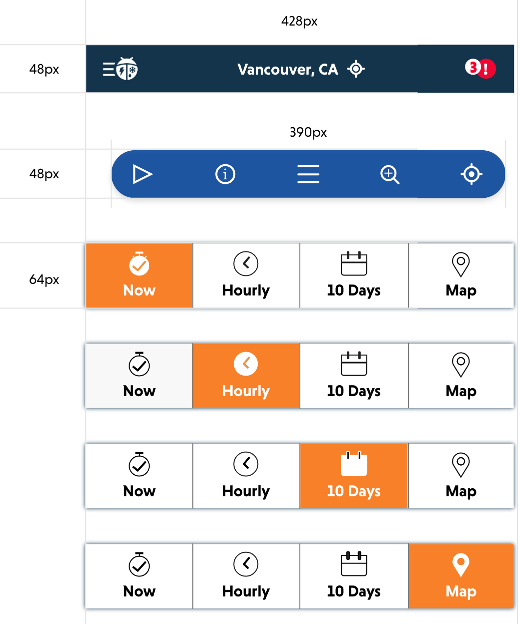
Header, Navigation bars made with 48px and 64px height and proper width they can be highlighted suitably by colour.
Buttons
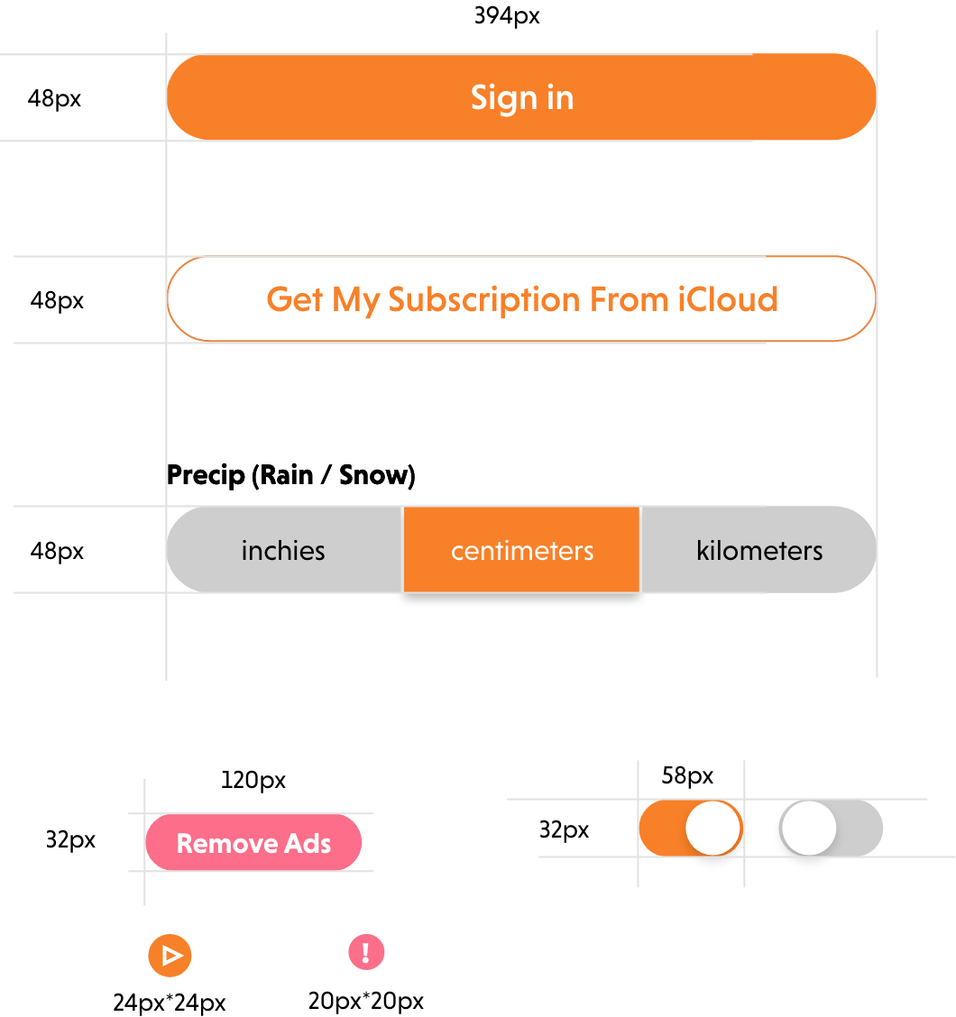
Buttons are made rounded and have different type like main buttons, secondary buttons, many choice buttons, slide button, smaller buttons (play, notifications…).
Text boxes
Text boxes have 24px padding for left and right, their width are often full width minus margins. All text should be align-item: center.

Feature 1 – Now and Location
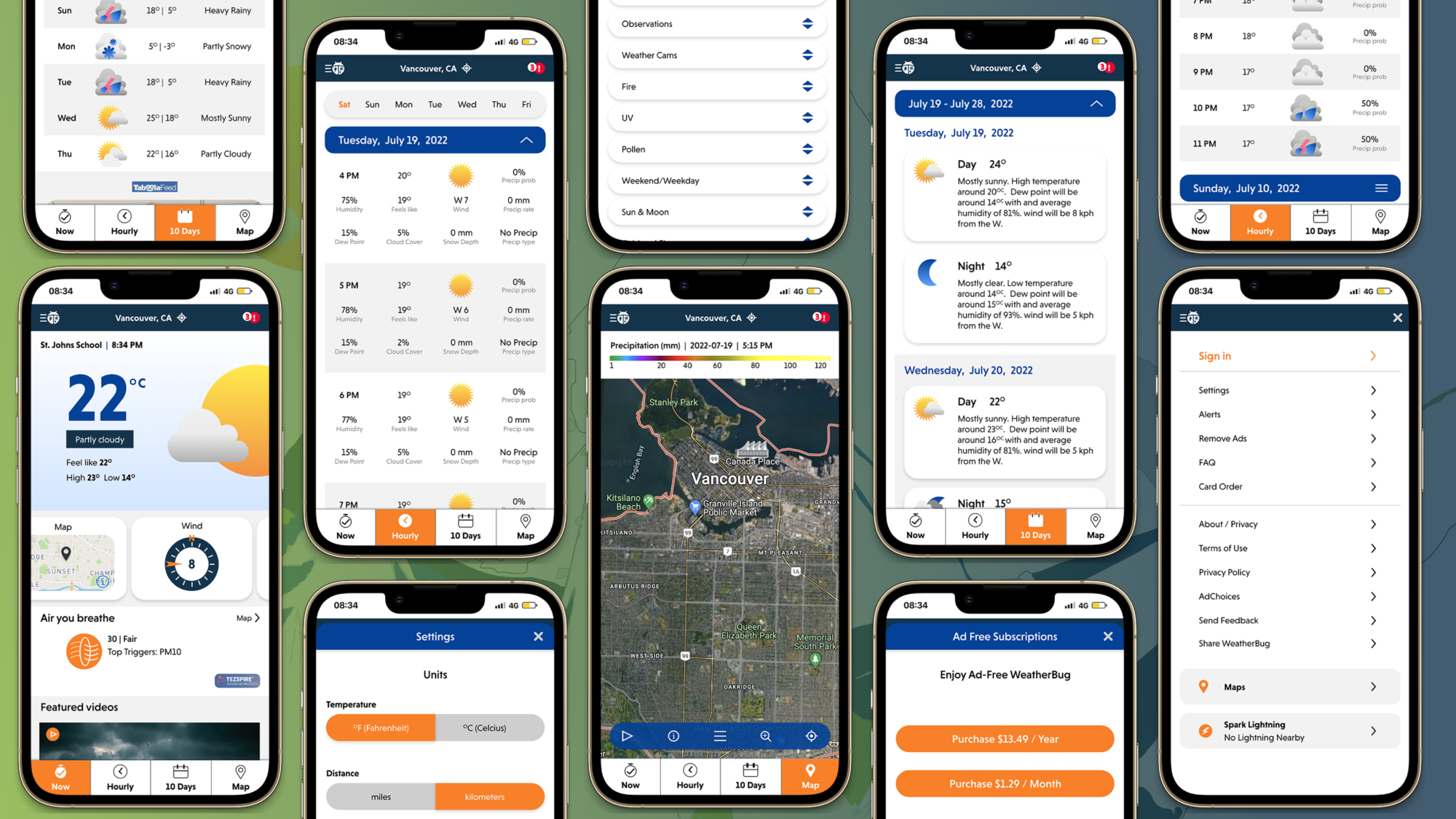
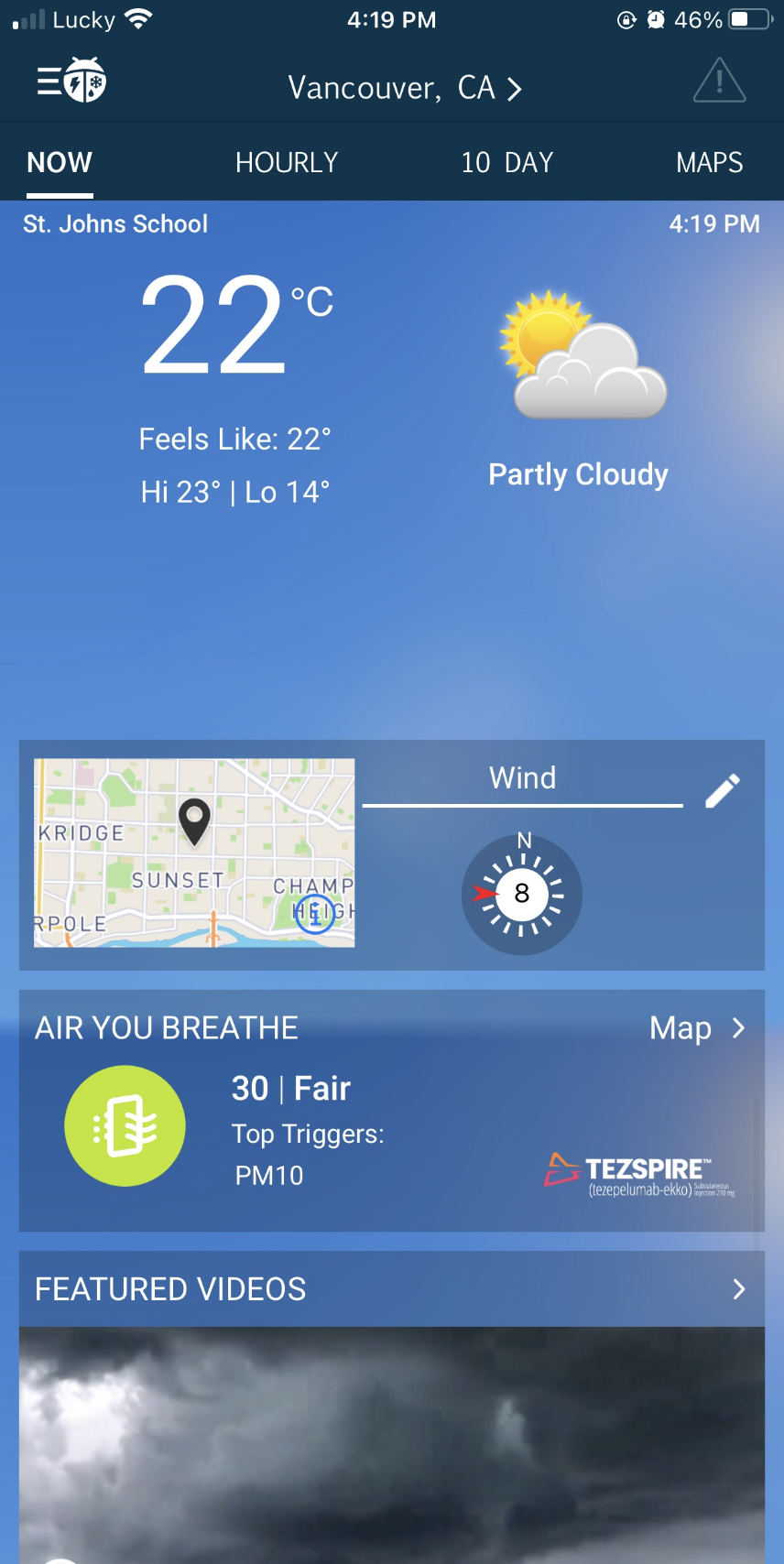
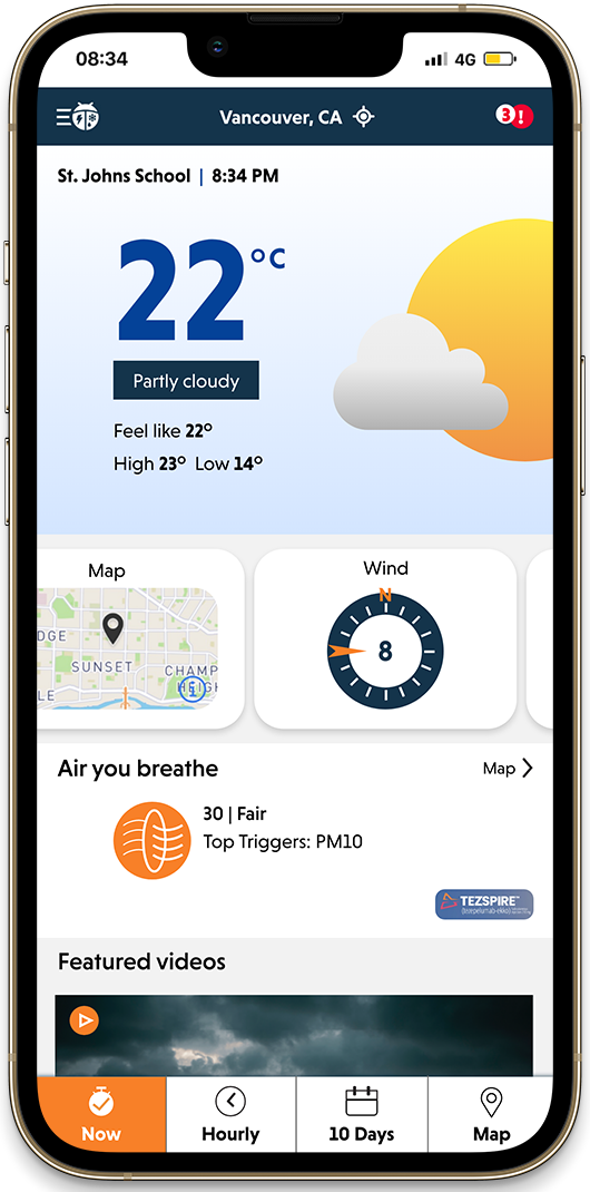
Now is the main page of the app. In this page, users can have quick informations of the current temperature, as well as set their location. They can also choose to see a few functions like Maps, Wind…
The Old version of the App is adapted from a website so it lacks of mobile optimization. I change all the necessary points such as: making current temperature to be visible and come with neatly animated style. Make carousel for a better interaction compared with “pencil icon”. My style of flat and simplicity is also easier for reading here.
Feature 2 – Hourly
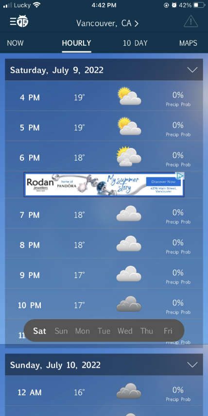
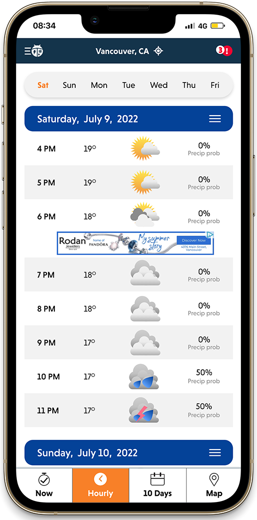
Hourly shows summary of weather within a day. user can use 2 modes: brief mode and detail mode. They can also choose with day in the week to show.
In old version of the app, the day picking is on bottom but this can be hard if we have a navigation bar like in the new version so I moved it to top. Day pick up is not really important in Hourly. I change background colour to white and light grey to support for user’s read.
Feature 3 – Maps
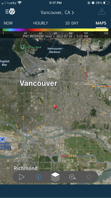
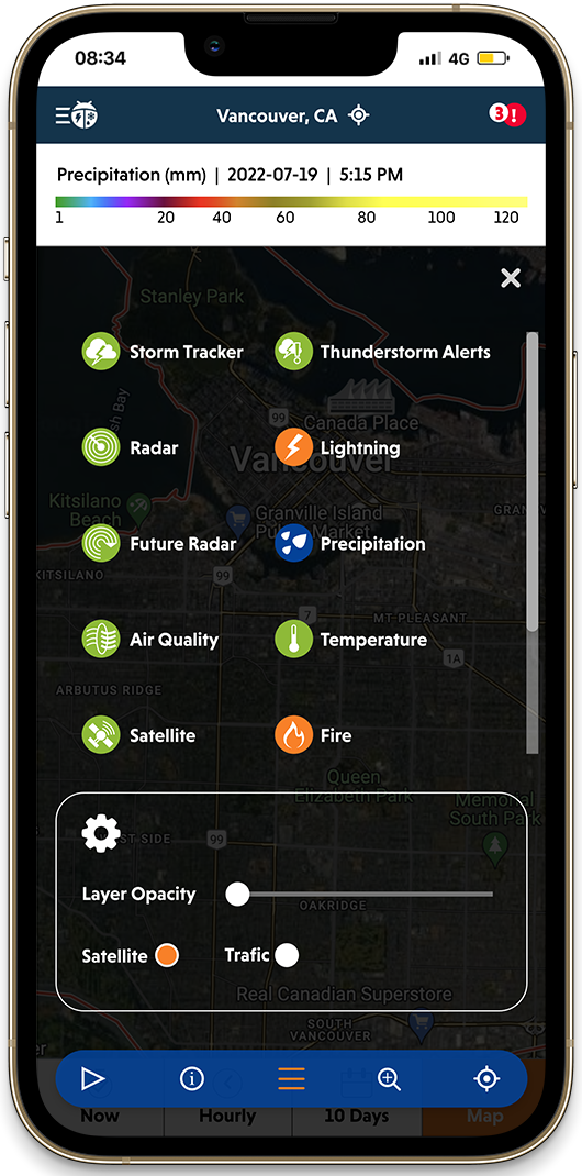
Maps feature allows users to see the current level of wind, risk of flashing…in their location. This feature includes some some displaying settings.
The old version of maps is very hard to see the layout and user can be really confused over the displaying. I recreated new layout and make new icons, illustrations for this page.
Feature 4 – Menu
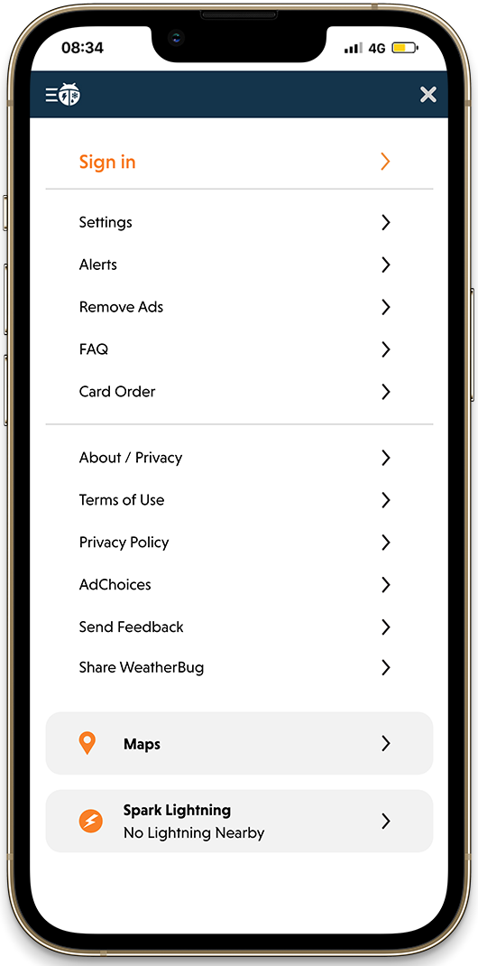
Menu helps users choose units, setting, see the ad options… This is the most functional part of the app.
The old menu is a rather narrow and hard to interact with, so I made new one full-page and have more effects when users do their actions.
