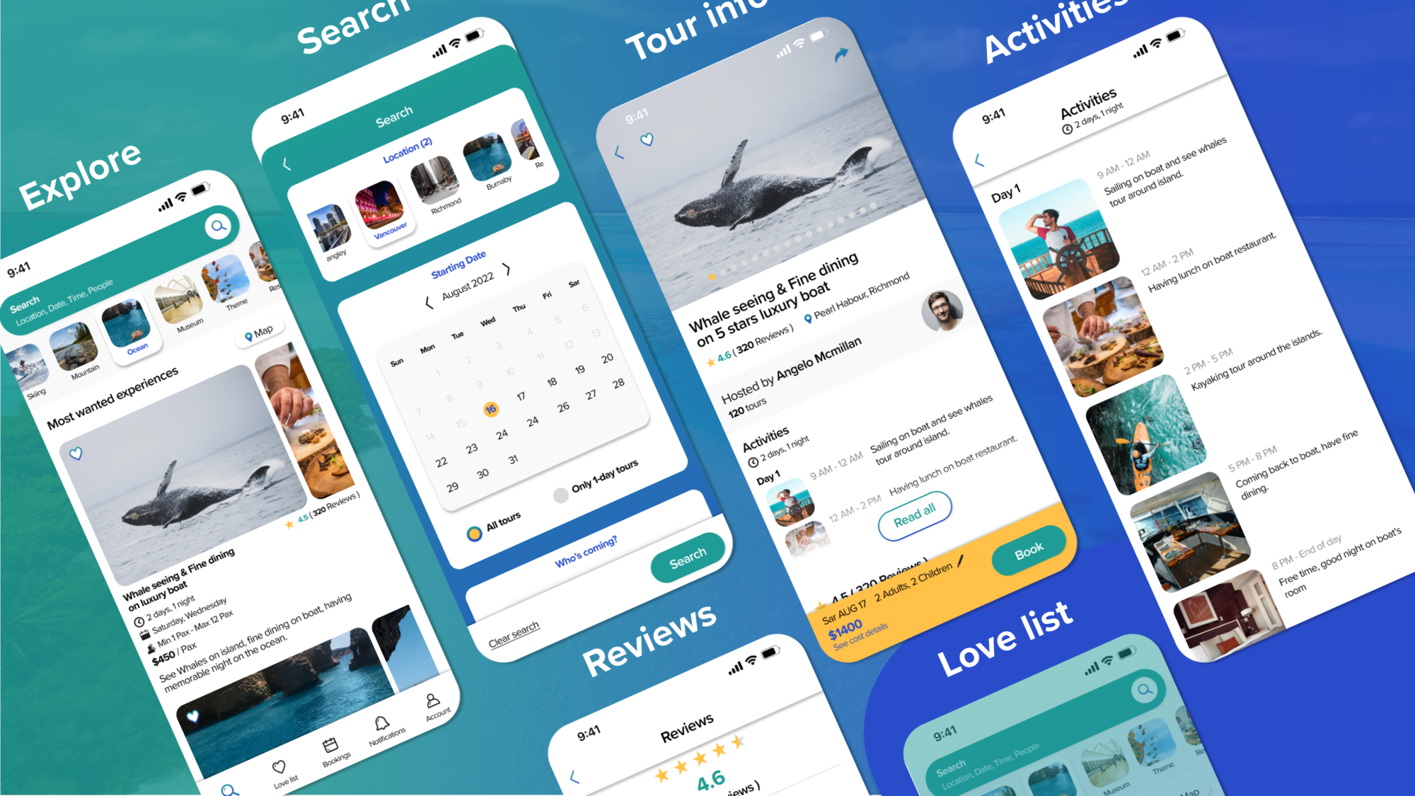
You are in new city and have no ideas of attractions nearby? No worries, Tourpal is here to give you unforgettable suggestions. With our mobile application, you can explore list of experiences, search tours by your references, see tour informations, see activities details, see reviews, book tour online… and many more functions are waiting to be developed in our ecosystem.
My Role in the Project
In this project, I am the lead designer (both UX and UI). We have a team of 3 designers and 3 developers. I am the one who makes user flow, wireframe, UI kit, mock up and marketing assets. Other designers helped me to collect information and support with the UI. So all aspects of this project are all my deliverables.
Idea and Process
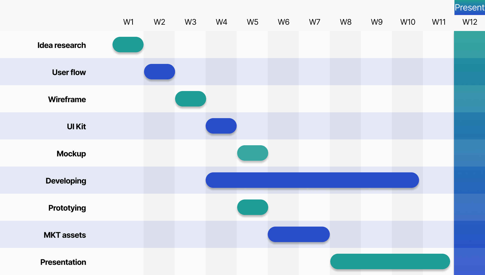
This project is a group project in my course at Langara College. Within 12 weeks, we need to make an app that is simple as our developer can not deliver an outcome for more than 6 weeks. After finishing the mentioned simple version I have improved the product for a better showcase.
Our product addresses a real demand of users in the city: exploring and booking local tours with as many details as possible. We researched our idea within the circle of college’s students, our family and relatives. Please see below chart for the timeline of this project.
User Flow
Wireframe
I often make very detailed wireframes before adapting them into mockups. So you can feel not really big differences between wireframe and my mockup. I think it’s a good practice to make detailed wireframes, it will support better user tests in the early phases of the project.
Typography
I chose the Proxima Nova typeface for the whole app. This font is a very balanced geometrical font and has a great X-height. The font can express the product’s inspiration: young, friendly, energetic.

Colour Palette
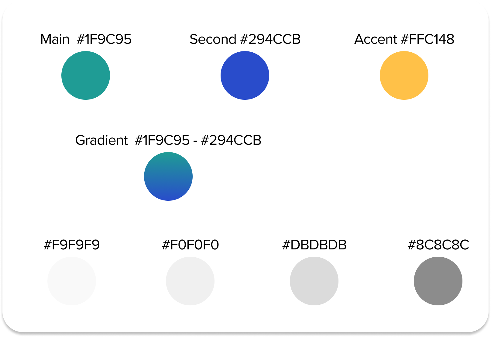
Main colour: Teal Green embodies the nature, lake water, fresh air, as well as friendliness, energy.
Second colour: Navy Blue expresses the trust-worthy characteristic, professionalism.
Accent colour: Yellow, help in special cases such as: review stars, some obvious buttons or text boxes.
And other Grey scales for background.
Icons
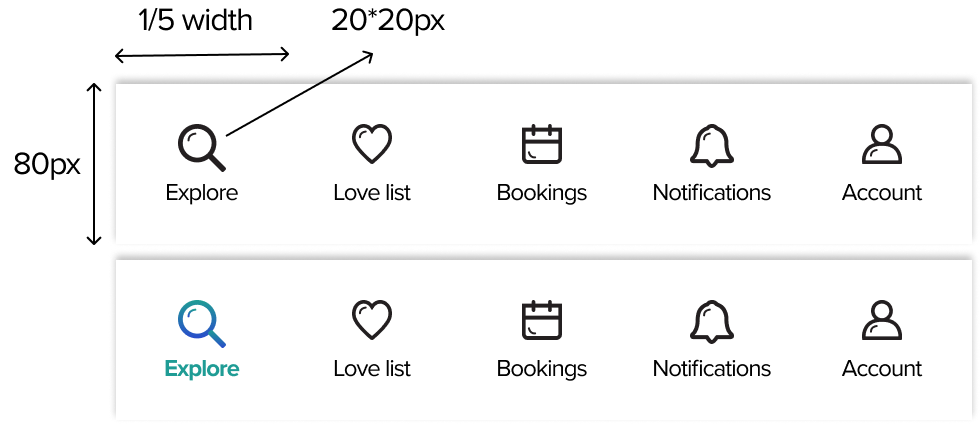
This app’s style is simple yet trendy, that’s why I choose to make very balanced icons with perfect geometric shapes. In some main icons such as explore, notifications…I added some 3D effects.

Navigation bar
Buttons
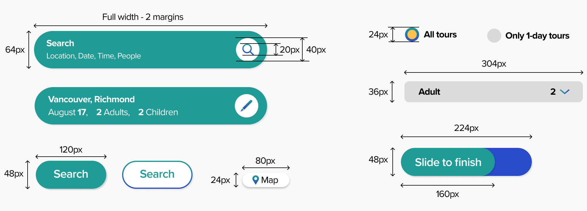
I always prioritize Multiple of 8 when designing any UI elements. This basic and must-have principle enhances the balance of the layout. If in some cases that is impossible to apply multiple of 8, I apply multiple of 4 as a back up.
Text boxes
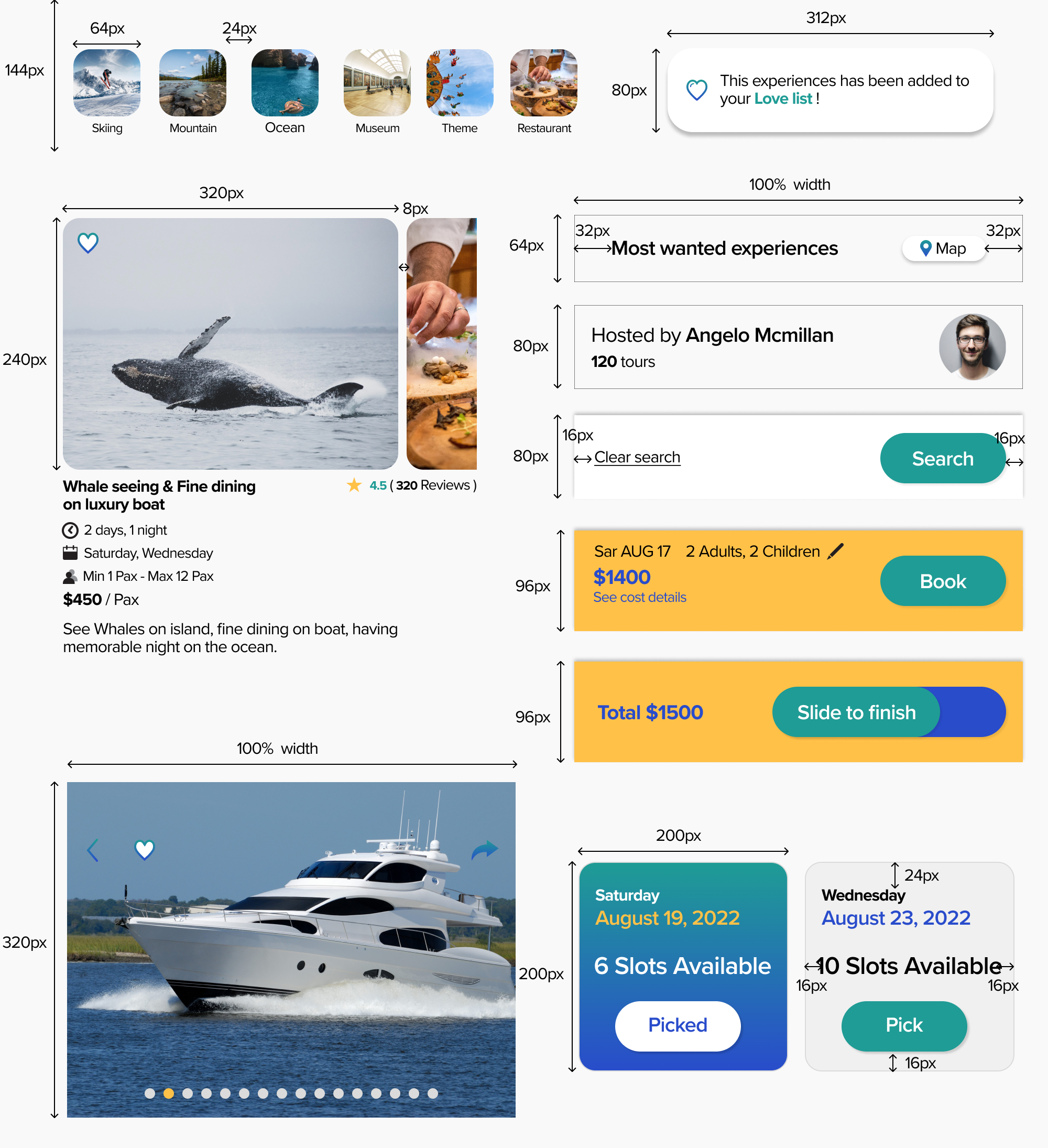
I always try to make it as detailed as I can when delivering UI elements to developers to help them with the accuracy.
Feature 1 – Explore List Of Experiences
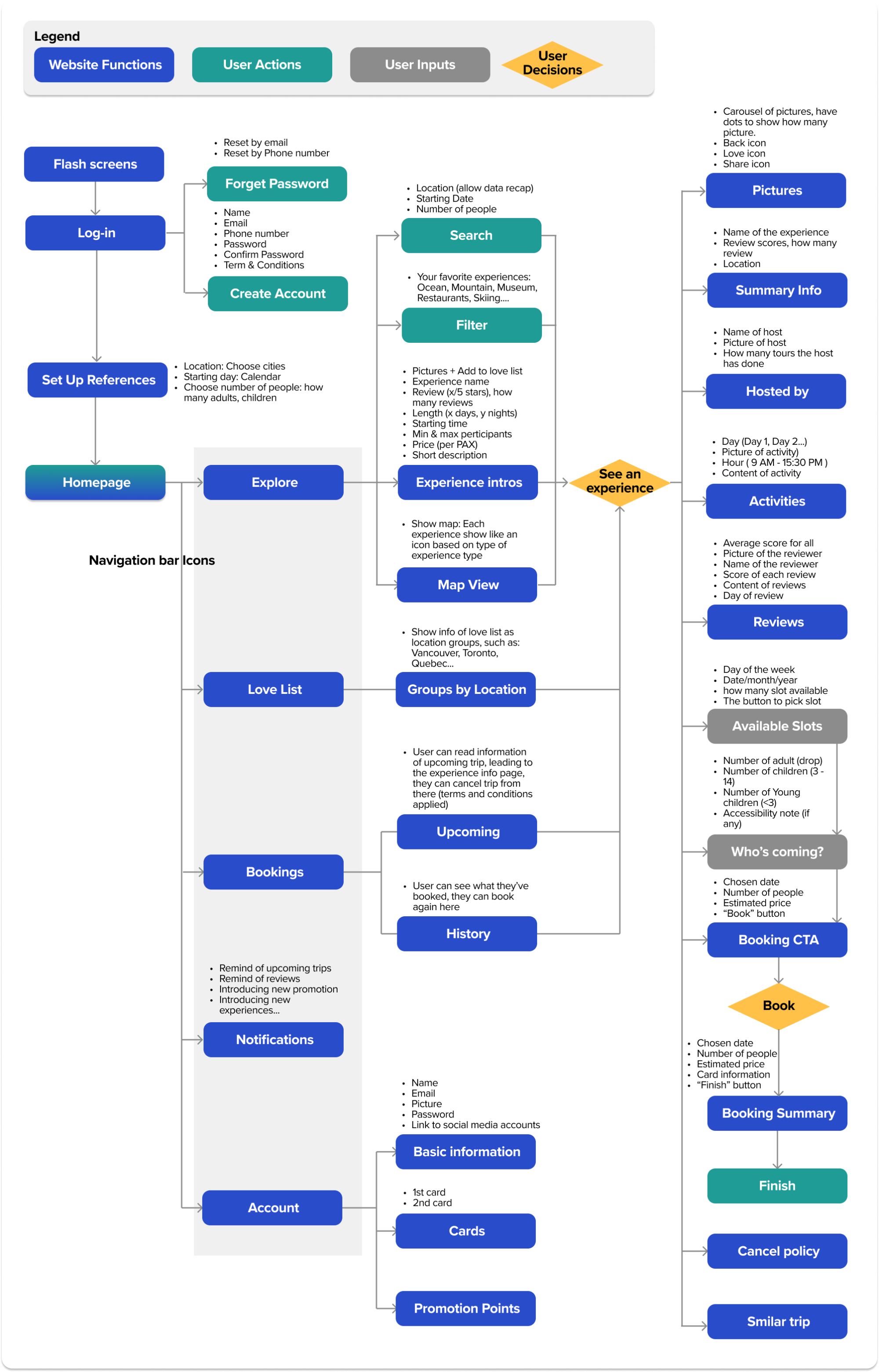
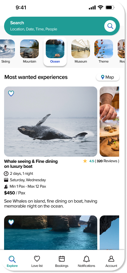
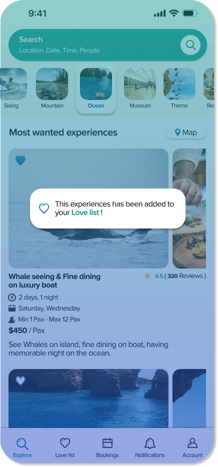
You can explore the list of experiences by a few ways: by scrolling, by filter or by Map.
Scrolling: List of experiences will be picked by user’s references (for the first time) and afterward, will be picked by machine learning.
Filter: List of experiences can be grouped by tags, each tag will be shown as one thumbnail picture, users can choose from this.
Map: Show the map based on current location (this function will be designed later).
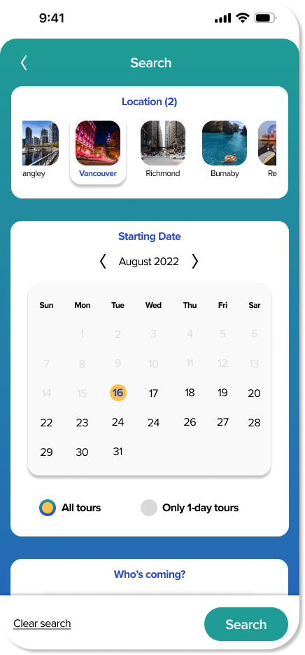
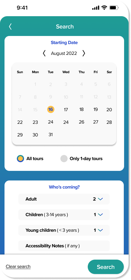
Feature 2 – Search Your References
User can search list of experiences by their references:
Location: Because this app is supposed to be local travel, so we can make location options by choosing from a carousel. If in future our app will be made for a bigger range of cities, we can make it another page.
Starting Date: Users can choose the starting day of the trip they want, they can also filter to pick “only 1 day” trip.
Number of people: Number of adults, children and small children. These are made as drop-down lists. Users can add a note of accessibility here if they want.
Feature 3 – Experience Details
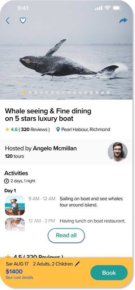
When user click to see an experience, they will find these functions:
Picture carousel: Have dots to guide users to slide and show where they are. Users can also go back, add to the love list and share the experience on social media if they want.
Experience summary: Includes experience’s name, review numbers, and location.
Host information: Can pop up to another page (has not been designed).
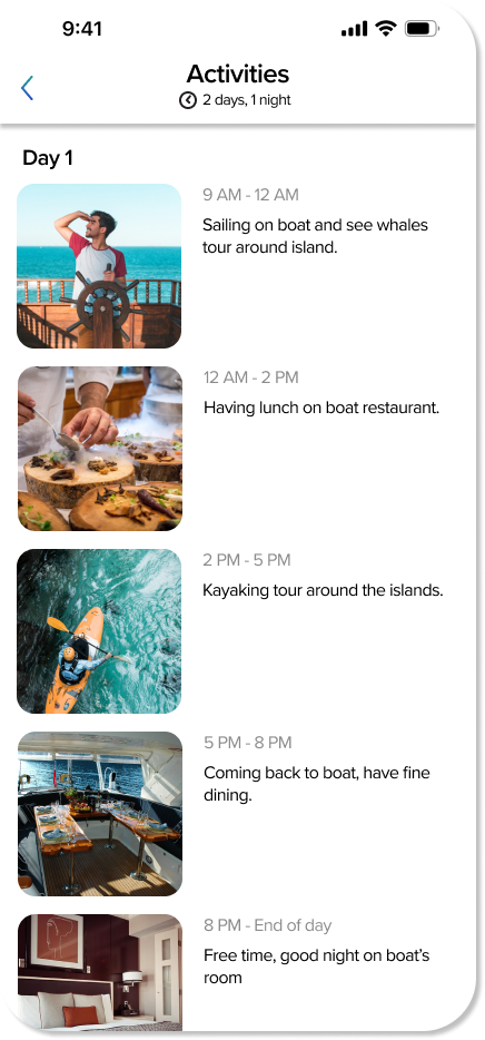
Activities: Leads to another page with detailed activities including small thumbnails, time and descriptions.
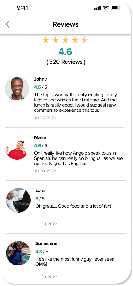
Reviews: Leads to another page showing all the reviews with pictures of reviewers, their names, the content and the time.
Choose time: show available slots (recap result from search for default here), users can change if they want.
Choose number of people: Show number of adults, children, small children and accessibility notes, users can change if they want.
Cancel policy: summary and “read all” option.
Similar trips: Show suggestions for users to keep them longer in the app.
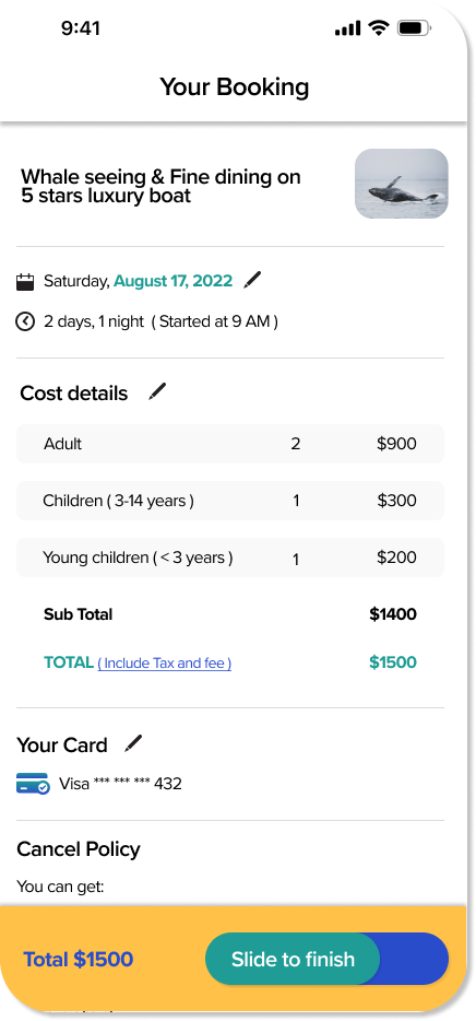
Feature 4 – Booking
When user come to decision of booking, they will see:
Summary: name of the trip with a small picture.
The day: Users can quickly change here.
The cost details: calculated based on the number of people, users can quickly change.
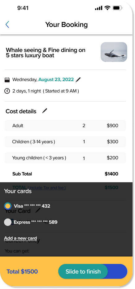
Card info: Take the 1st default card here, users can change if they want to.
Cancel policy: Show cancel policy again for the user to refer before making a decision to book.
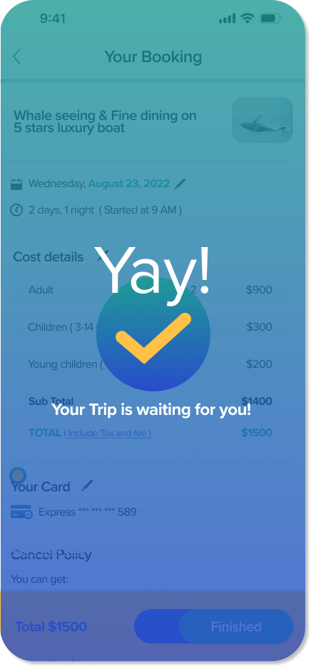
Slide to book: Show the total number and have a slide button to finish.
