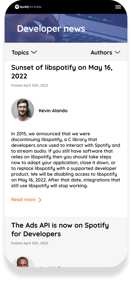
Spotify is a very strong brand in terms of the design, I chose to make this project to challenge myself and explore new aspects that I can improve from an already-good design.
Project’s Target
This is a UI redesign project, so I only experiment new UI directions without changing significantly the UX traits. I expected my works to deliver:
A different feeling for user: New look, trendy UI.
Balance and friendliness: Fix some UX related points and improve readability.
Experimental UI: This is just to experiment new UI traits that I hardly do in my usual projects.
Typography


Colour Palette
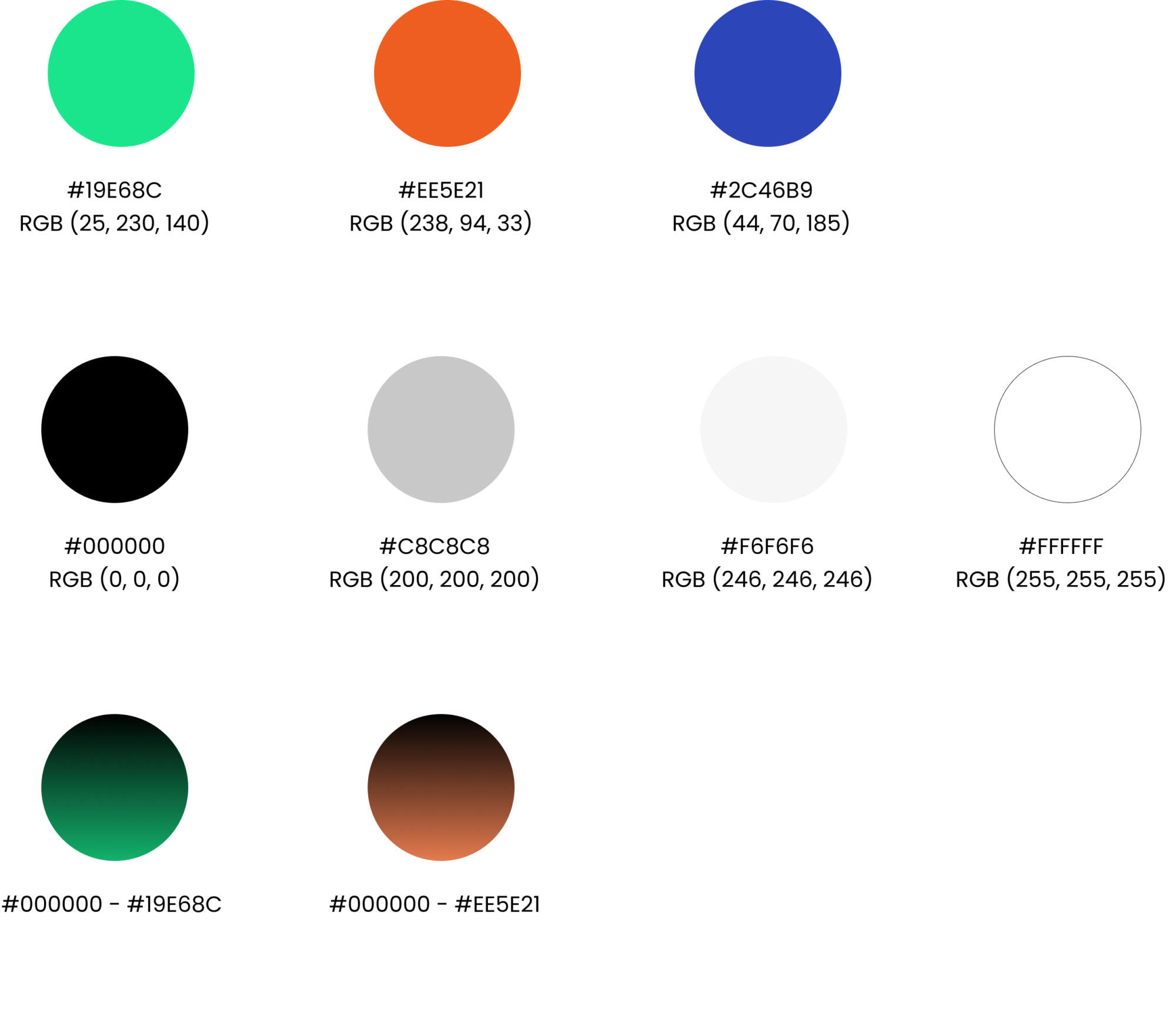
I kept the brand colour of Spotify and added 2 new colours: Orange and Blue. This combination is chose based on my direction of making design to be young, call to action and functional.
Page 1 – Life At Spotify
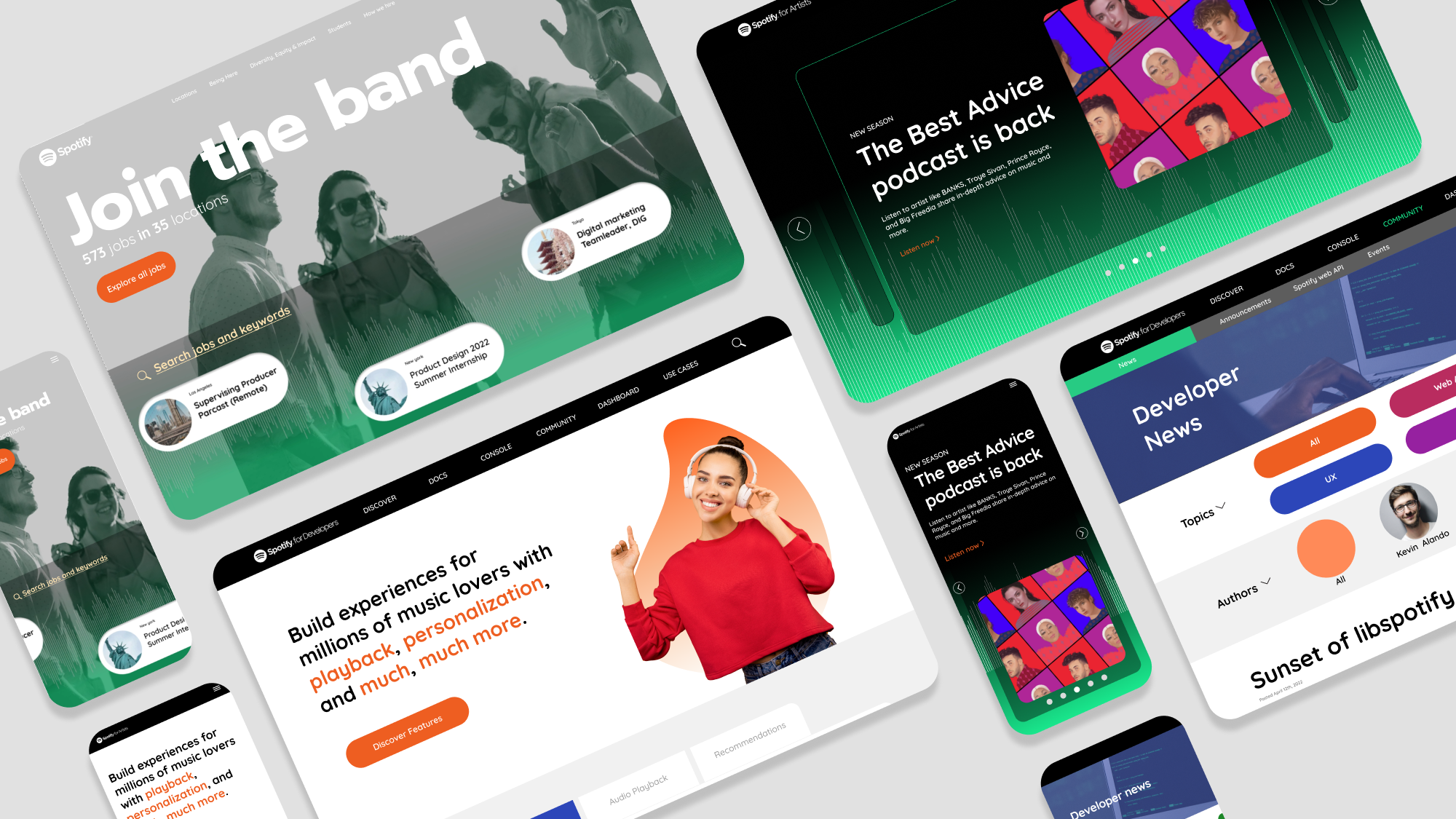
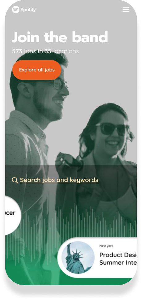
Life At Spotify is a very elegant and beautiful page, I adore this page and be inspired by it a lot. By my work, I just want to recreate something different and fun for myself. Instead of simple and flat I make it to be a little bit bold and glass-looking. This is an employer branding page, so It would make sense to have a big banner with a band of people instead of just one.
I also create a mobile version for this project, so this website would be responsive for many devices.
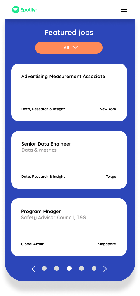
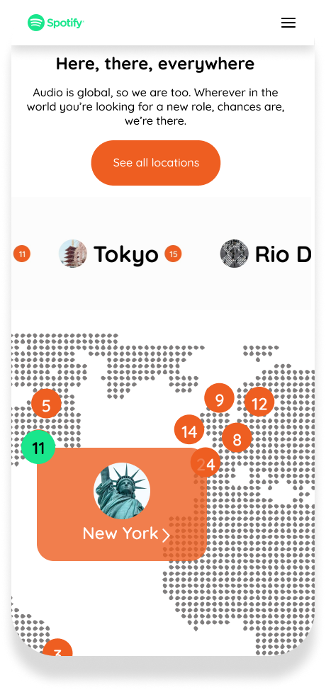
I made elements for this page with variants so they can reflex the animation when we hover and click. All elements were designed with multiple of 8 so their pixel can be balanced in the layout.
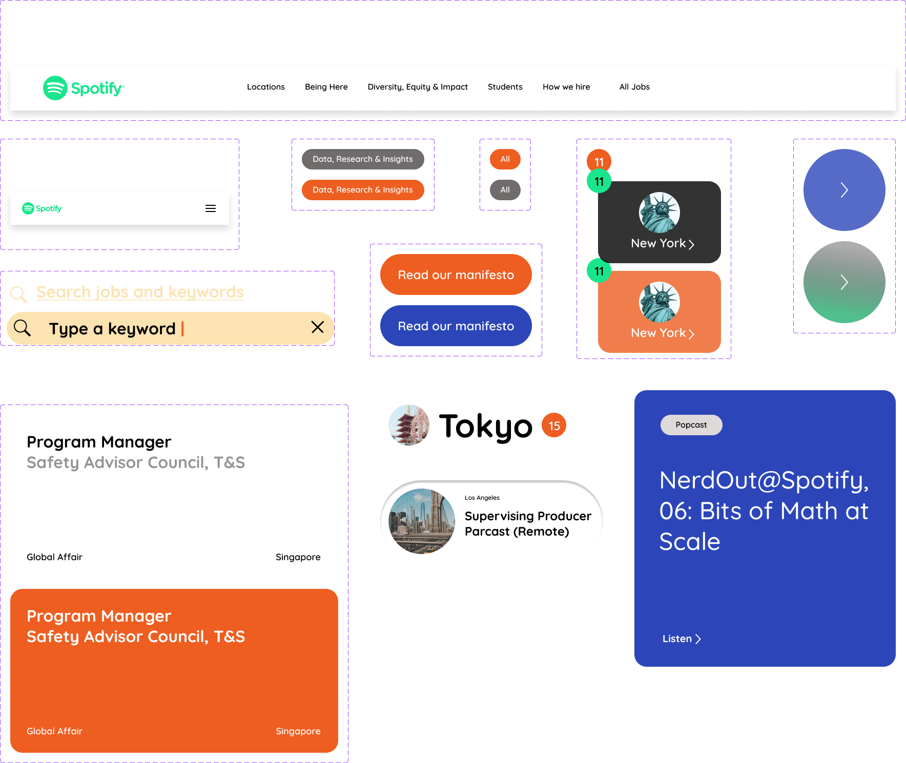
Page 2 – Artists
Artists is the page for artists to get advices and login to their account on Spotify. This page in reality is a little simple so I decided to make it more responsive and has more fun effects.
This page is also came in mobile version.
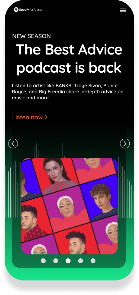
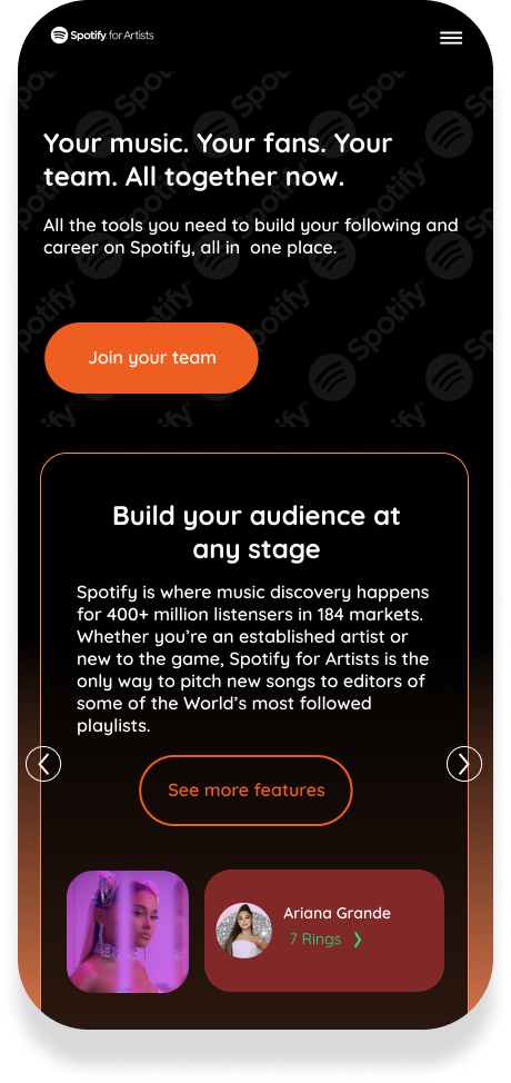
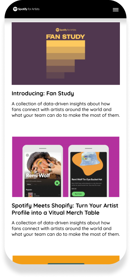
This page’s components are simpler but still come in different variants for prototyping.

Page 3 – Developers
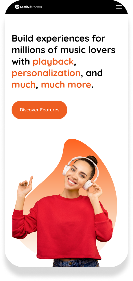
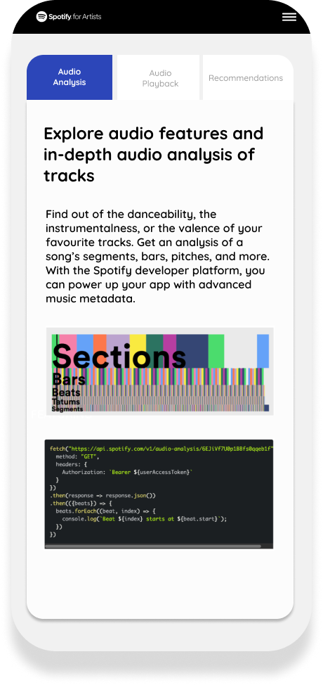
Spotify for developers is a functional page, It doesn’t contain a bulk of designs but needs to be clear and easy for developers to get informations they need for their work. I tried to make it into a simple yet functional page.
If in “Life At Spotify” and “Artists” page I adapted more glassmorphism style, in the pages for developers, I made them very simplicity.
Page 4 – Developers Community
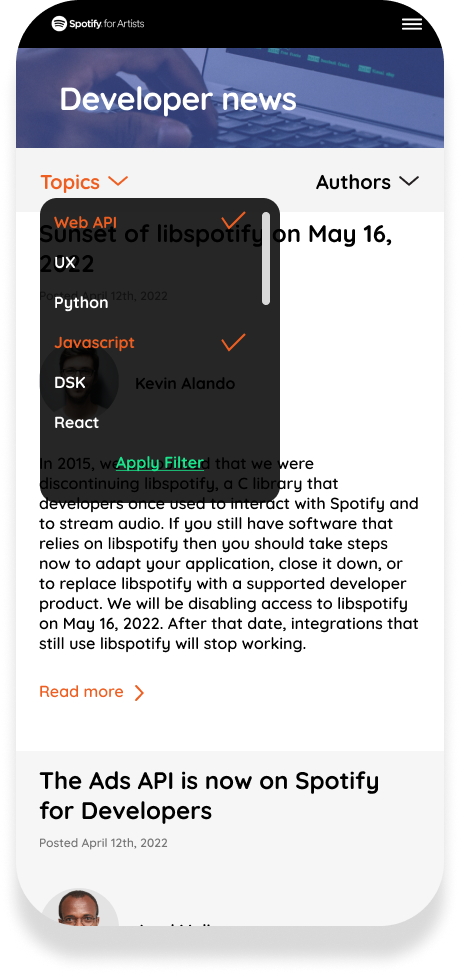
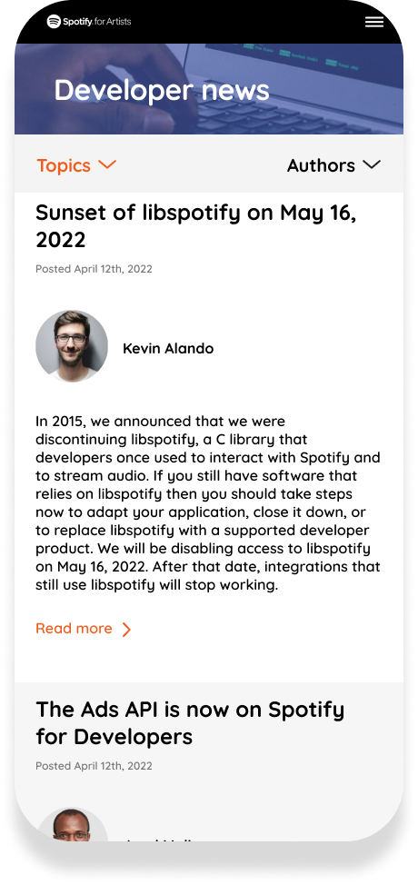
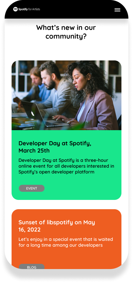
In Developers Community, I created a new function, it is filter, allowing users to filter by the topics (tags) and author they want to read. These functions will be made as slide bar and visualize for users to have a better interaction
On Mobile, this filter will be replaced by simpler drop-down choices for saving the space and optimize user’s interaction.
