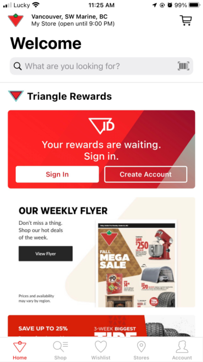
Canada Tire is a very well known brand in Canada, they have a history of 100 years. Although their website is a very complicated and functional e-commerce platform, the mobile application is still not optimized properly. I decided to make this project to improve both UI and UX for the application.
Project Target
Through this work, I want to:
Enhance the UX: Bring more functions and make it more convenient for users to do the actions.
Improve UI: This app’s UI needs to be remade to have a fresher look, approaching the modern direction of an e-commerce application.
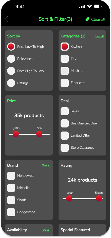
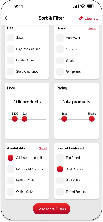
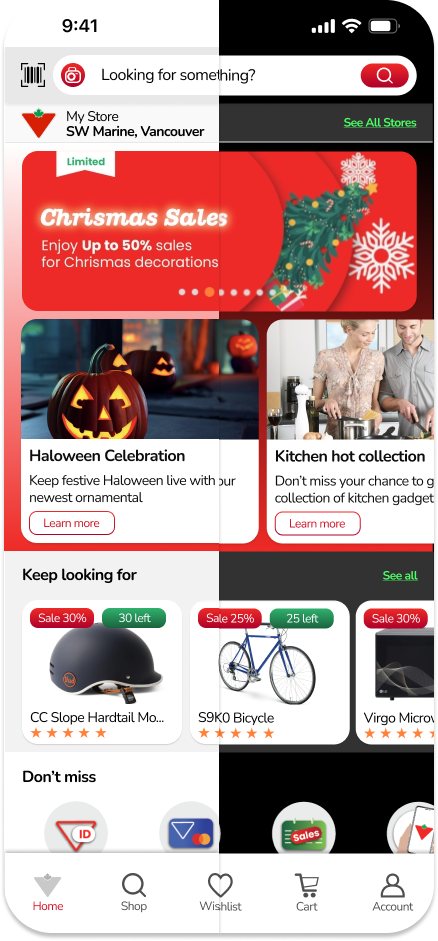
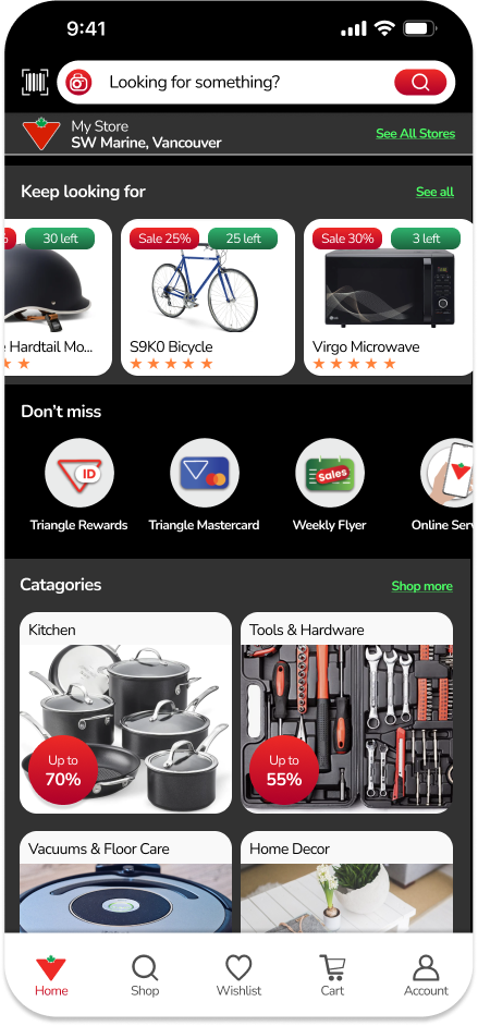
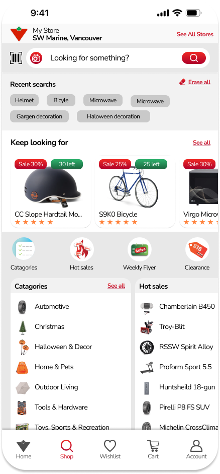
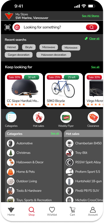
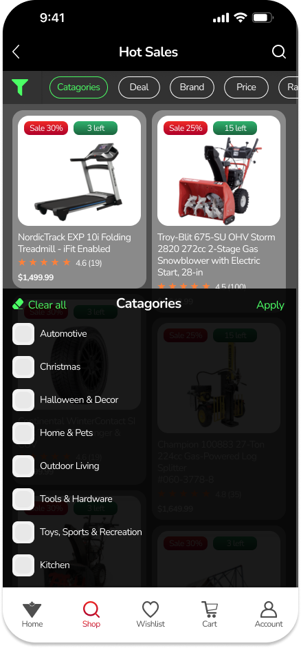
Adapt both modes: I made both light and dark modes for users to have a choice based on their references.
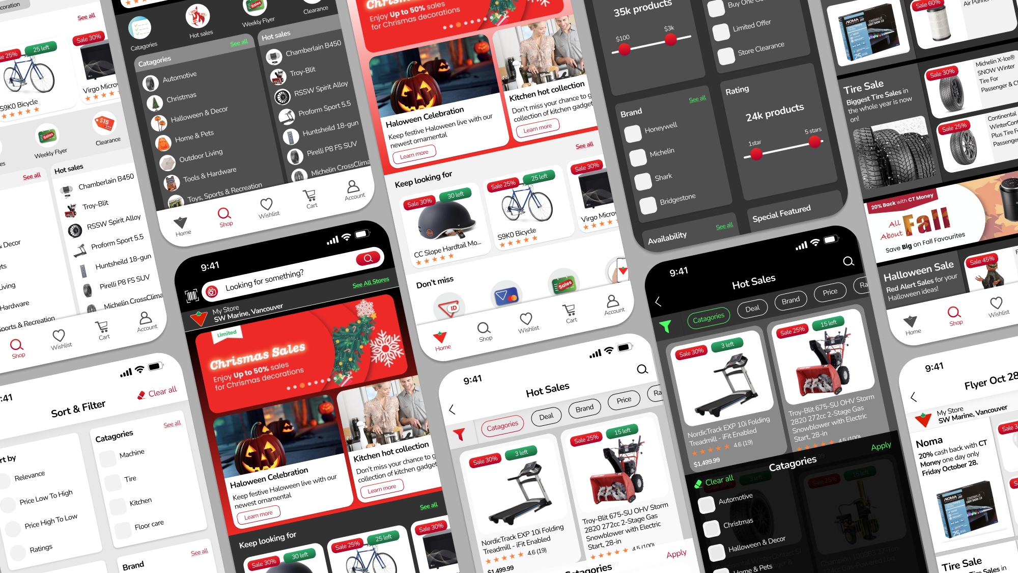
Light Mode vs. Dark Mode
Current trends of applications often offer users to see the app in dark mode to save their phone’s battery and keep their eyes relaxed, so I make it 2 modes here in order to follow this practice.
Typography
I chose the Nunito typeface for this project. This is a very rounded font with good X-height. It can support readability very well while bringing a friendly and a little funny feeling.

Colour Palette
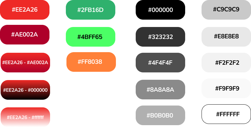
For this project I used 3 groups of colour:
Group 1 – Red: Red is the brand colour of Canada Tire so I used it mainly in my design. I added a darker red to create linear as well as having more variants to use when required.
Group 2 – Green: Green is the accent colour, it also appears in the brand colour, so I choose it for supporting and using in the dark mode. I added a neon green for call-to-action in dark mode.
Group 3 – Grey scale: As I do both light and dark mode, so I use a variety of grey scale colours depends on how it should work.
Icons
Icons of the app can use 2 modes: light and dark, in light, they can be black or red, in dark, they are neon green.

Buttons
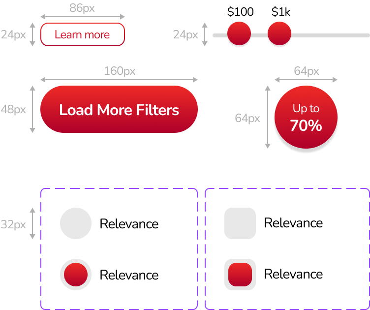
While making any elements, I always adapt multiple of 8 for each pixel to make the balance in the layout.
Illustrations
I tried to make all illustrations around red, green colour but because this is an e-commerce so the icons should be colourful to tell the difference between them.
The banners were made with some techniques in typography and played around with drop shadow.

Text boxes
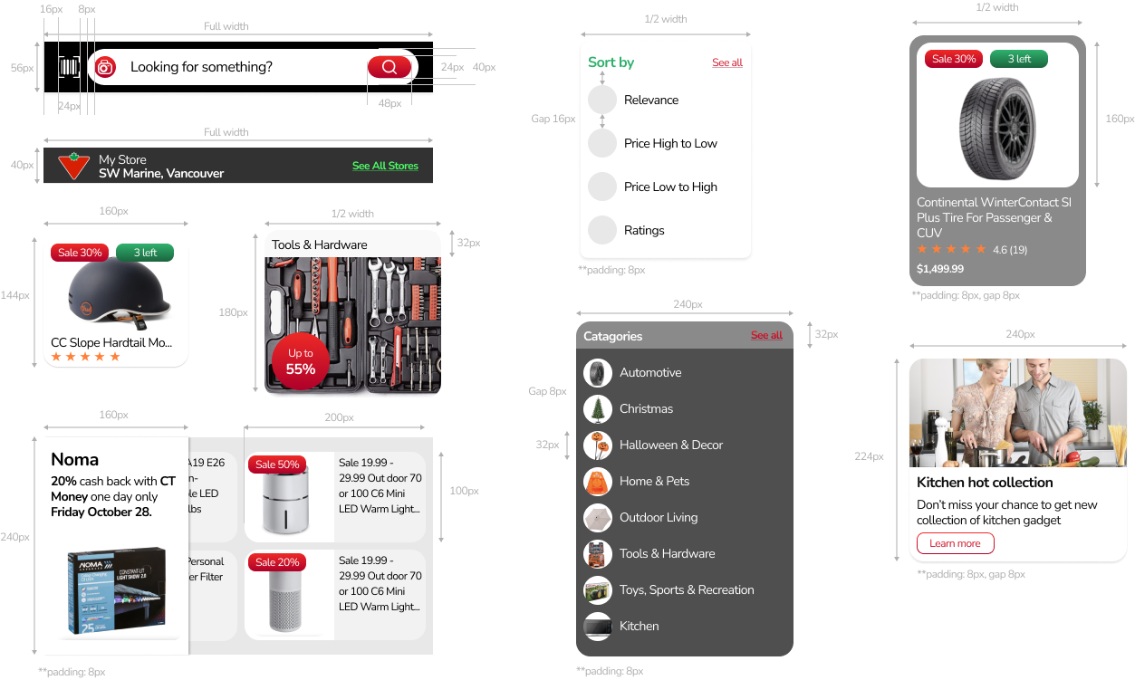
I made all text boxes with pixel perfect approach, so when I hand these out to developers, they will know what to code in CSS.
Feature 1 – Home
In Home Page, I made these changes:
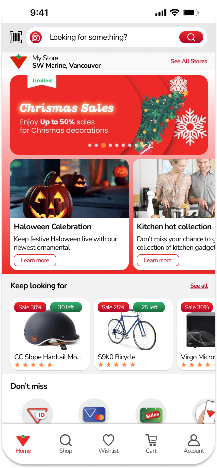
Add new running banners section: This is a most noteworthy area of the Home Page, we’ll spend this for seasonal sales, flash sales or any must-see content, the banners will change automatically after 3 seconds, or users can slide to see the next / previous content. This area also comes with a carousel.
Move “Keep looking for” up: I moved this up and made the text box simpler, I think we’ll want people to keep track with their purchasing.
Make Illustration for “must see”: I made the “must see” section into illustrations to save space while still keeping the user’s attention. I would think the section will be better this way because it is very focused.
Simplify “Categories”: Make categories into small but very visible text boxes which have red linear outstanding call-to-action buttons.
Feature 2 – Shop
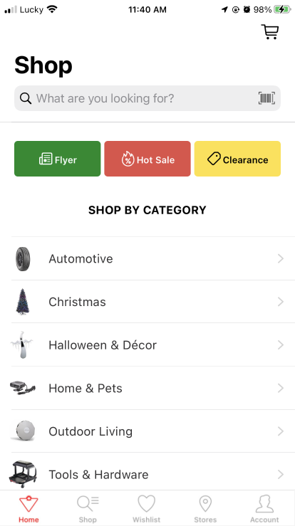
Shop is where users go to look for their items. At the moment, the function requires users to click many hidden pages, their clicks are duplicated. So I bring out hidden functions, make them into icons and carousel text boxes. I also add “recent search” and “keep looking for” here for a better call to action.
Feature 3 – Weekly Flyer
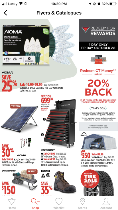
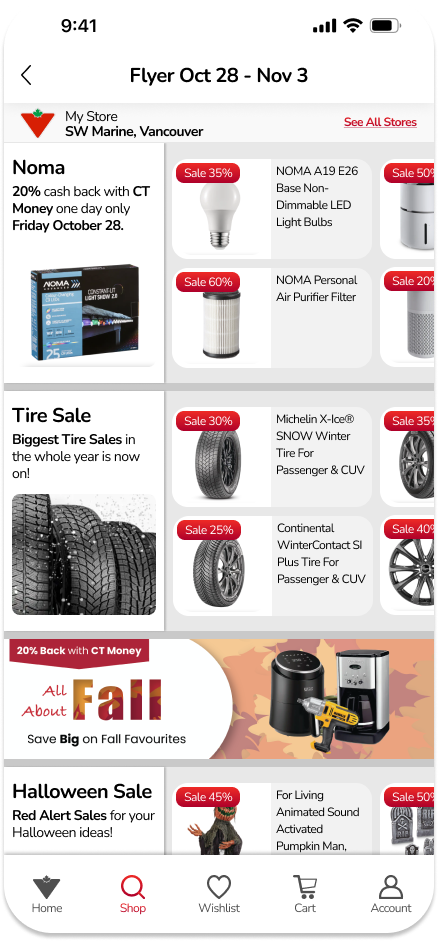
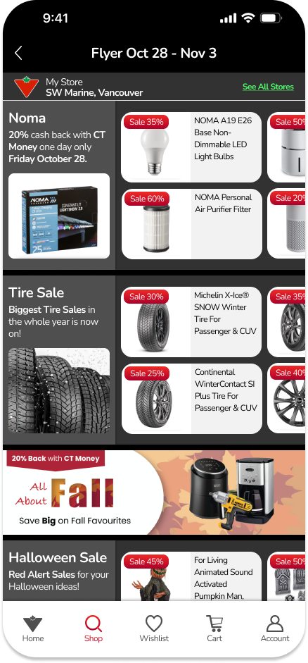
Although Weekly Flyer is a very highlighted function in the app (it appears in the Home Page and Shop Page), It is made very simple and messy now. So instead of just pdf uploaded, I transferred them into groups of pictures, with short descriptions, and discount info.
These groups are made horizontally for users to have the key points first, then find out the details if they want.
And I made this page simple as it is supposed to be updated weekly, so should be as simple as it can
Feature 4 – Hot Sales
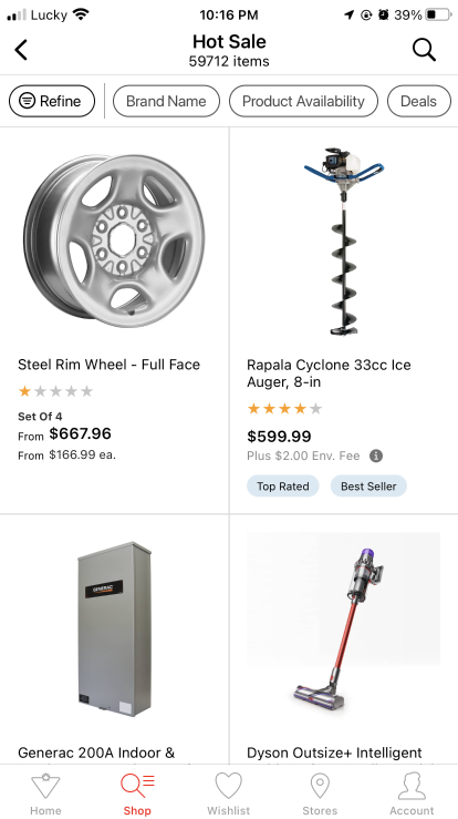
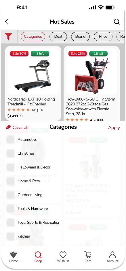
In the Hot Sales section, I kept their UX mostly, because it was already good here. I just changed the UI to make it more friendly. So Instead of making all text boxes have the same height, I keep the flexibility as they are supposed to be. And the filter part is optimized too (see the next feature).
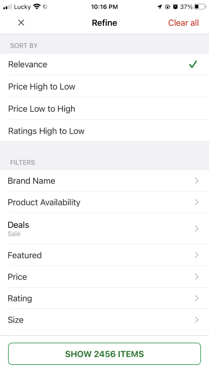
Feature 5 – Filter
For the filter, I onboarded new points:
Hybrid filter: If users apply any filter criteria, it will be marked with colour and move to the top for easier keeping tracking.
The clicking options: Instead of making just a “tick” for chosen things, I changed it to “clicking” buttons, if users can choose one (for example: the “sort by”), it is supposed to be a round button, and if users can choose many, it is squared ones.
Sliding buttons: For some options like price or rating, we can enhance the interaction by sliding buttons, it saves space and makes it easier for the user to do the action.
“See more”: The current filter of Canada Tire is very long and heavy, for an ordinary user, it looks very redundant, so I changed it into a “see more” button, if users have demand for detailed searching, they still can do it.
